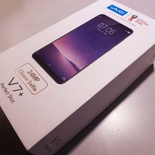
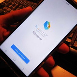
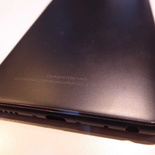
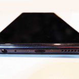
The V7+ is Vivo’s flagship smartphone for their entry into the Singapore Market early this year. Released globally in September 2017, it sits as a mid to high-end phone set to compete in the already crowded market segment. I briefly introduced the phone previously last month where Vivo Singapore first announced the phone. Today. let’s check out the phone in the flesh in my extensive Vivo V7+ phone review. Also, I shall be looking into form, hardware and practicality of Vivo’s newest flagship phone.
New kid on the block
Vivo might not be a brand first to mind when talking about Chinese phones. In the likes of incumbents such as Huawei, Xiaomi or even OnePlus. Vivo is a budding new brand in Singapore looking to make a name for themselves in the already crowded Smartphone market. You might recognize them as a major official sponsor for the FIFA 2018 and 2022 World Cup too. Furthermore, Vivo is part of the BBK Electronics portfolio with subsidiary brand to Oppo under their belt too.
However, Vivo in particular is no stranger to the consumer smartphone market. The brand has a big presence in China. Moreover, it is one which Vivo touts for providing consumer smart phones equipped with cutting-edge technology at very affordable prices.
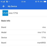
Since their branding founding in 2009, Vivo has since expanded their presence in 20 markets globally. This includes their main markets China, Hong Kong, India as well as Taiwan, Thailand, and Malaysia. This year, Vivo is looking to expand their presence in Singapore with the Vivo V7+ and Y65 phones. The V7+, code named “Vivo 1716” is also known as Vivo Y79 for the China market.
Vivo touts for providing consumer smart phones equipped with cutting-edge technology at very affordable prices.
Under the hood and Box
Under the hood is a Qualcomm SDM450 Snapdragon 450. It is a 64-bit Octa-core 1.8 GHz Cortex-A53 CPU coupled with 4 GB of RAM and mated to an Adreno 506 GPU. While the specifications of V7+ is not exactly high-end, it is healthy and adequate for the usage patterns for majority of users out there. Moreover, it offers benefits of battery life longevity which I shall covered in the battery performance part of the review.
The packaging box is minimalistic in design too. Out of the box itself is the V7+ unit with an Apple-ish box held together in a cardboard holder. You get an assortment of manuals, guarantee cards, SIM-ejector pin as well as a Gel case slotted in the cardboard backing.
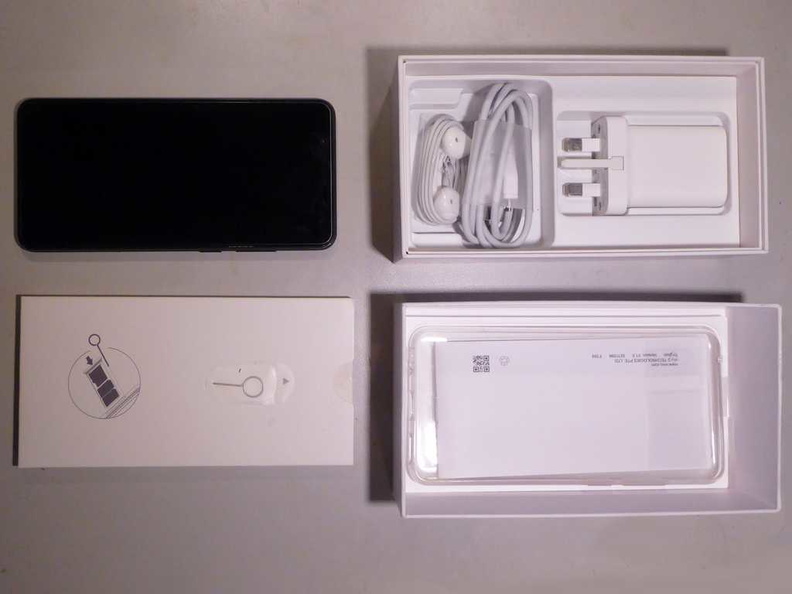
Additionally, you get a regular 5 volt 2.4 Amp charger, a Micro-USB fast charge cable. In my package, there is a soft gel case included with the phone. A standard V7+ plastic screen protector is pre-applied on the phone out of the box. This screen protector is not tempered glass and could scratch easily with daily use.
Exterior and Good Build
The V7+ form factor and design is typical of touch screen candy bar phones in the market. Albeit, bearing some resemblance to the iPhone 8 or the OnePlus 5. The phone is available in colours, champagne gold, matte black and infinite red.
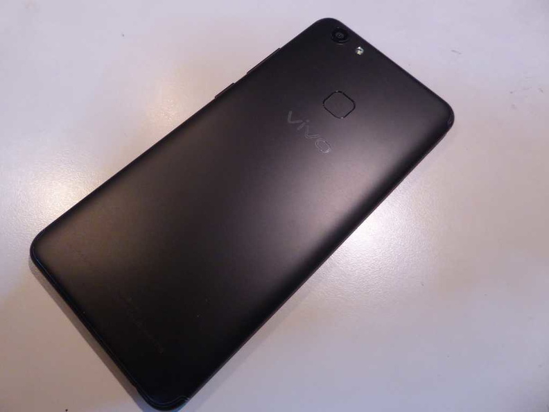
Visually, the phone is sleek in black. I found the Matte Black the nicer of the colours available. It reflects a sense of sophistication and luxury associated with the Matte Black look. The design of the phone is clean and sleek.
Additionally, the phone is cladded in aluminum and plastic. It is solid and gives the phone a premium feel. There are noticeable plastic bands on both the top and bottom of the phone. These plastic bands are areas which houses the top sensors as well as the mobile and Wi-fi antennas.
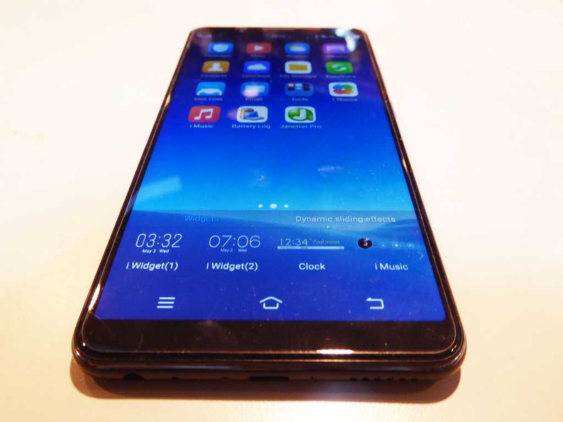
Moreover, the V7+ controls too are rather intuitively laid out. Physically, the bottom of the phone houses a microphone, micro-USB charging port which supports fast charging, a mono speaker, as well as a 3.5mm headphone jack (thankfully).
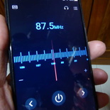
The headphone jack, when plugged in with your headphones, uses the wire body as an antenna for the in-built hardware FM radio. Hardware FM radios are fast becoming extinct in most modern phones these days. It is a throwback to a feature fast replaced with digital radio, and internet streams. Glad to see the option still available.
the phone is cladded in aluminum and plastic. It is solid and gives the phone a premium feel.
Less than exciting Screen
Flaunting the front of the phone is Multi-touch IPS LCD capacitive touch screen. It sits under a layer of Corning Gorilla Glass 4. The 6 inch screen itself has a 18:9 aspect ratio. Hence its form factor is tad longer than your typical 16:10 screen. However, it does not feel large when held with one hand.
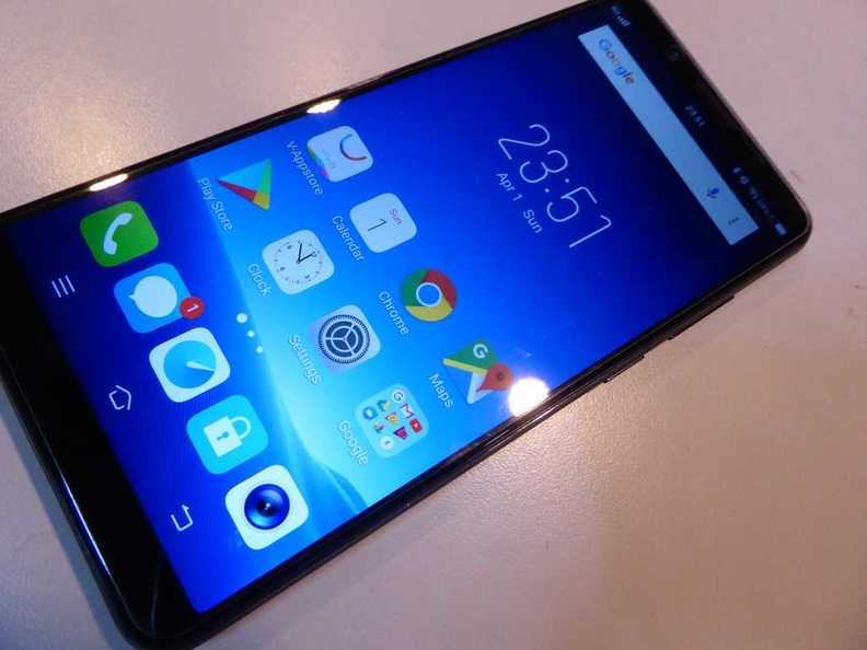
Also, this screen ratio allowed Vivo to cramp in more screen without making the device width wider. This is reminiscent to what we first saw in the Samsung Galaxy series, where the form factor became mainstream.
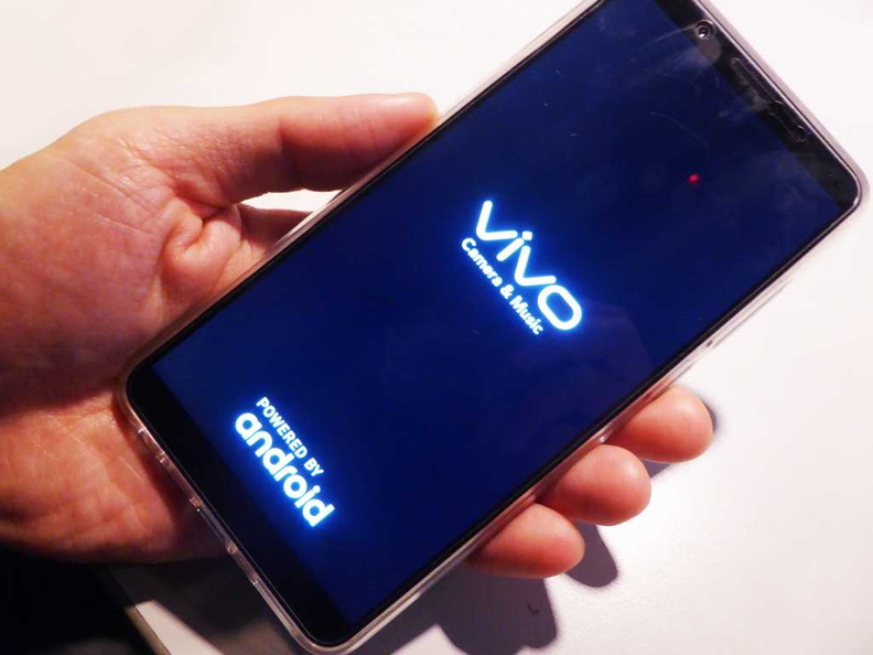
The phone feels lightweight and balanced in-hand for its size. The exterior dimension sits in at 155.9 x 75.8 x 7.7mm and weighs under 160 grams. This form factor yields a ~78.4% screen-to-body ratio. One-handed operation and typing on the phone is comfortable with two hands even on the stock keyboard.

Strangely, in the age of High definition (HD) and even quad HD screens in flagships, I found it intriguing that Vivo went for a sub-HD screen. The resolution sits in at 720 x 1440 pixels offering 16 million colors. The pixel density correspondingly sits at 269 ppi. This isn’t what you call “Retina range“. For an IPS panel, the phone has impressively deep black levels. Also, the screen is tad more on the blue side, though you can easily switch to a warmer colour via software.
The sub-HD screen is more than adequate for small devices such as phones. Though you will experience some quirks such as HD video and images no scaling up and not appearing as sharp. You will also need to scroll more when browsing. But the visual difference between a retina-like display and this sub-HD screen for its size is minimal.
Intuitive Exterior Buttons
There are no buttons on the left side of the phone with only a small pin-hole and sim-slot. The right side is dominated by three buttons. These are the volume up and down buttons as well as the single power button. The power button is located below the other two, towards nearer midway of the phone.
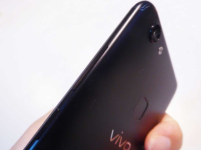
In real-world use, I found having all the buttons on one side of the phone intuitive and removes button guesswork. Particularly on which side the power button is located. This is particularly useful when you phone is in your pocket.
Good Connectivity and Expansion
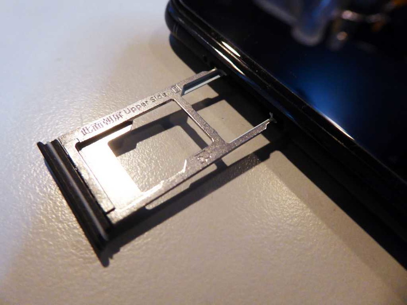
For mobile connectivity, the phone supports dual-sim standby on GSM/HSPA/LTE via dual Nano-SIM slots. Dual-sims are the norm for Chinese phones. The V7+ flaunts its oriental background with similar offerings. Ejecting the hybrid sim-tray at the top left of the phone reveals a rather lengthy card tray.
The tray has space for a single Micro-SD card too in addition to the two said nano-SIM slots. This allows you to accommodate up to an microSD, expandable up to 256GB to complement the phone’s 64 GB Internal in-built storage.
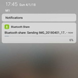
Additionally on the wireless front, you get the usual bells and whistles such as Wi-Fi 802.11 b/g/n (including hotspot functions), and Bluetooth 4.2. Wireless performance is solid and I am pleased to report no issues on daily use. I however, had some issues with Bluetooth file transfer. Connectivity at times was sketchy, with Bluetooth dropping between file transfers. Moreover, there is no NFC support, as well as wireless charging.
Call quality of the phone is good. There were no crackles, pops or distortion to voice. The phone also provided good feedback on voice calls as well on speakerphone calls.
Software and Speedy UI
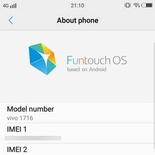
However, despite its minimalist spec, the phone is quite a speedster for productivity. The Funtouch OS is Vivo’s proprietary skinned UI running on top of Android 7.1.2 (Nougat). Menus are zippy and responsive, especially to quick swipes.
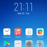
Moreover, the home screen is set up with a grid like series of apps, largely similar to iOS. In my usability tests. I found the menus really optimized with frame rates consistently above the 30 fps range, at times hitting 60 fps. Providing for a butter-smooth UI experience.
Rearranging the Home screen icons is similar to how you do so in iOS too. Holding the home button will bring the home screen into an jigging icon “edit” mode. Here you can move apps icons between screens, folders, uninstall or delete them.
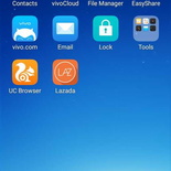
You however, cannot remove system installed apps including Vivo apps from here. With the exception of a few Vivo apps such as the V-appstore and V-cloud service, I am glad to report that there are not many bloatware preinstalled on the phone.
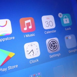
The menus are fast and speedy. Unlike iOS, you can rearrange icons to any position on the grid. I would however prefer stock Android experience. Undoubtedly, the UI totally screams Apple iOS, which you can tell where Vivo got their design cues from. Despite this, the UI is fast and responsive across home screens.
On use on apps such as web browsing. Page loading speeds are fine and the Chrome browser performs well and able to provide a speedy browsing experience with no rendering jitters. Web browsing view port visibility is limited and let down at times by the V7+ small sub-HD screen. Picture don’t appear as sharp and crisp as say rendered on a HD or UHD screen, such as the Oneplus 5 or Galaxy S9. This limits what you are able to see at a go on a page.
In the next part of the review I shall touch on the phone benchmarks, camera and battery performance, as well as the conclusion to my review.

