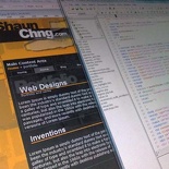
Well, progress on the site revamp is rather fruitful. It started with a rather tough fight to get div containers to go fluid on percent values for a 3 column layout, fixed width divs are more predictable over a range of browsers, so I am still contemplating whether to allow the fluid width option for content. Nevertheless I am quite happy with how the site is coming up so far. Though the site looks very similar to the current one, I can say that the codes are 50% leaner, is world wide web consortium xhtml 1.0 and CCS compliant and can easily load just as fast, the best of all, there are no tables in sight now! Now it’s just a matter of fixing PNG transparencies on IE6, which most users still browse with.
The design is almost 100% finalized but that is just it. Now it’s a matter of upgrading some of my code and content throughout the site, thereafter, it’s quite alot of coding for the upgraded shoutbox, so there is quite alot to do. A cool new feature on the site is that since it’s running off a single stylesheet at any given time, I can get it to automatically load a new one whenever there’s like an occasion, say Christmas, New year’s day, National day, Friday the 13th, Halloween, Earth Hour, etc duh. So it can be rather interesting to check out the site on these days.
This new design has it’s primary focus on the user, so there will be lots of accessibility enhancements such as AJAX search, dbx-boxes, font adjustments and readability. The site’s main font size will be increased as well, to Arial 12px. The blog will be running on the latest version of wordpress and gallery. Though I have yet to get used to the new admin layouts on my test environment, I still prefer the old wordpress top admin bar.
More updates to come.


I say forgo IE6 users and stick to fixed width, easier to manage.