Colouring in Photoshop
I use primarily Adobe PhotoShop 7.0 for computer generated art and for colouring my black & white pieces, it a very much cheaper alternative too actualy buying physical colouring tools and supplies for colour. Ulead photo express is my second most used software, though I prefer PhotoShop for its tricky yet advanced palette and brush effects.

Powering your paintbrush- workstation hardware
Photoshop can be very resource hogging at times, especially after scanning in or working with a high resolution image. This is true for the very recent releases of Adobe photoshop. What you need least is an unstable system prone to crashing once its system resources are all eaten up. Usually the “save your work every 5mins” rule tend to apply as a guide rule to prevent lost of unsaved work in a crash, but overall, a faster dedicated computer will tend to lead to more working efficiency and lesser headaches. what you need least is a crash to throw your mood and working momentum off-course.
Basically, for a basic photoshop workstation I would recommend at least a 2Ghz computer or 1.7Ghz for dual cores with at least 1GB of ram, 10GBs of free harddisk space & of course a graphics card capable of displaying higher resolutions, given you more workspace. Other comfort factors include a good precision optical mouse for accurate selection and colouring, and a reasonably large (at least 17″) CRT monitor capable of displaying colours up to 32bit accurately (not 16-bit LCD monitors as colours shown are usually not accurate).
Transferring drawings to & as CG art on the computer
To actually get started colouring in photoshop, you have to import the piece. I strongly don’t recommend taking pictures of your piece and throwing into photoshop, even in this age of how evolved digital cameras are now. Use a scanner. Start by having TWAIN or scanner utility import the scanned image to photoshop.
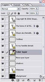
Layers had been one of the most useful features in PhotoShop since it was introduced. Though its more of an integrated palette introduced long since the photoshop series came up. It allows me to work in layers, which is handy when moving pieces of your work to be modified separately with their own properties. My typical workpiece will usually have the following basic layers created:
- Outlines (Lineart)
- Base (Flat) colours
- Reflections
- Shadows
- Corrections & maintenance
- Background
General workspace layout
As they are say, the bigger the better. Generally, its good to work with a large work area, where you can conveniently access all the panels and tools at hand. To achieve so, be sure to run photoshop at a minimum resolution of 1024×768. Professional displays are getting more affordable these days as well and I will recommend a proper calibrated LCD display at 24″ and above, so you will have at last 1920 of horizontal width, the higher the better.
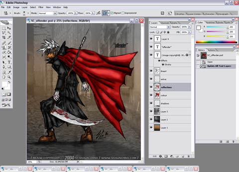
Digital tool lineup
Next let me go through some of the basic tools you would be using in this tutorial. The default panel on the left of the workspace is known as the tool panel, conspiring of all the primary tools you need to manipulate your art piece. Anti-aliased brushes are commonly used for outlines, to give lines a more dissolving and not a straight blocky feeling. Though this was commonly known as the airbrush back in photoshop 5.0. Version 7.0 allows you to define anti-aliasing though the brush palette. The pencil tool is mostly used for colouring while the brush tool is used when varying intensities or when colour pressures are required (like giving the way for light, reflection effects & shadows). The pencil tool do not have the level of variance and control.
The lineart
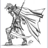
This is how a freshly scanned piece looks like into photoshop on the right. Here you can choose to crop it, clear away noise (aka”dirty scans”) in the picture using the eraser/white pencil tool or resize it to your desired dimensions. Though I would usually recommend working on the image at near scan resolution (e.g about 2000×1000 for 300dpi A4 scans) for better images as the end product would normally be compressed/minimised (i.e for the web) allowing for a smoother, sharper image.
Moreover, by doing so at least you will have a high resolution workfile for clear printouts too. When done, its time to create the outline (or lineart) layer. Cut the whole picture out using the “select all” then “layer via cut” options, then you will have a new editable layer in the layers palette consisting of this outline. Next go to this layer’s property and under “blending options” set the general blend mode to “multiply” (see picture below).
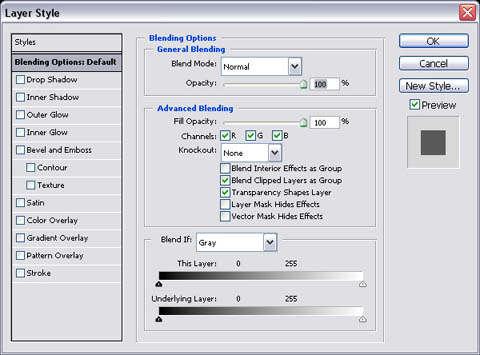
As shown above, simply select “multiply” under the outline layer’s blending options. This will allow you to see through this layer on another (superimpose). This is particularly useful for colouring the piece using another dedicated colour layer below the lineart layer without messing up the lineart layer itself, at the same time having the outline casted over the image all the time as a guide.
Adding the base colours
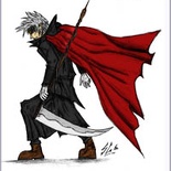
Next, start colouring only using the pencil tool (i.e non anti-aliased, smooth edged tool), keeping within the lines or desired image. Here is the first step to colouring where we want to quickly and effectivly fill the image with a base colour. Use larger brush sizes to effectively colour open spaces and shrink the brush accordingly for smaller, detailed colouring. Moreover, here is where the lasso tool shines, allowing you to select and colour within the selected small gaps and details without “spilling” colours.
Try to keep to one colour tone for each surface, i.e skin, metals, clothing.. etc. as more tones would be added later, remember what we want now is only the base colour. Once done, the end result is a rather complete yet flat coloured piece on the left. Tip: zoom levels in whole numbers offer the clearest & smoothest image views (i.e 25% , 50%, 100%, 200%.. etc) be sure to spend most of your time working at these resolutions, whereas those at decimeter zoom levels (i.e 16.7%, 33.3% 66.7%) usually offer crisp, more blocky views.
Reflections & shadows
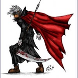
Over a new overlying layer (otherwise known as the “reflections” layer), use the brush tool to paint the lights, shine & shadows casted on your figure, given your desired source of light. In this case I choose light coming from the upper left, so naturally the lighter parts will face left & any objects covering the source will have darker shades of the respective colour (not only grey or black). To effectively lighten or darken colours, use the “lighten & darken” options under the “brush property mode” palette.
In combination with the dropper tool, select a colour you want to lighten/darken, go to the colour palette to select desired shade within the spectrum & paint using the lighten & darken modes accordingly & respectively. Why use the darken/lighten modes? Its so as not to accidentally change the shade of a desired point, moreover it allows a more gradual & controllable change of shades, resulting in more natural looking reflections. Its also easiler than actually selecting the actual colour to paint on directly.
Finishing up
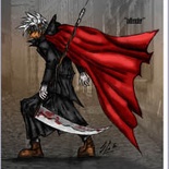
Finally, here is where the picture is almost done and complete. Its also the time where minor fixes or further detailing are made to make certain features stand out, therefore the need of another, I call optional “touching up” layer. Finish the picture by adding a desired background to go with the overall picture, crop or resize for exporting/saving and presto! done.
Remember, there are endless ways to create and colour a picture, this tutorial only serves as a basic guide of one of the many styles I use, and I can’t deny that I am always learning something new everyday as well. So it pays to draw and experiment with new techniques, there’s more than it meets the eye and you won’t know what you can discover along the way.
That is all I have for the tutorial for now, remember: the sky’s the limit!
Line art and planning your piece
Digital colouring with Photoshop

