The Vivo X21 is a new smart phone with the main selling points of offering top-end features in the mid-range segment. With the 2018 World Cup currently in tow, you might recognize Vivo as the official mobile sponsor for the international event. The phone is currently on sale and was launched in China on March this year. Let check it out in my Vivo X21 in-depth review.
Vivo, together with Oppo (their sister brand) sits as products under the BBK Electronics portfolio. Vivo is a relatively new brand within our sunny Singapore shores at least. But they have a rather sizable presence in Singapore now. This is in the likes of other well-known Chinese branded phones such as Huawei, Xiaomi or even OnePlus.
Under the hood and box
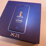
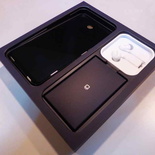
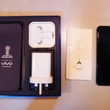
The X21 box packaging is tad bit larger than usual. It is themed to go with the FIFA world cup livery in Russia. The cardboard box is split into two compartments with your phone on the left and accessories on the right. Additionally, included accessories include a pair of white in-ear earbuds, a soft gel case, as well as a quick 3-pin USB charger. The charger can provide quick charge at two voltages, starting with a first mode at the base USB at 5.0 volts, 2 Amps and 9 volts at 2 Amps after fast charge negotiation. You can charge the phone from a near flat to full under 2 hours.
Quick specifications at a glance, the X21 under the hood spots a Qualcomm SDM660 Snapdragon. It is a 64-bit Octa-core CPU coupled with 6 GB of RAM. These specifications are not upper-tier and sits well against other mid-tier phones in the segment like the Xiaomi X1, Nokia 7 Plus and Xiaomi MI A2.
Exterior and Solid Build
The X21 takes on a regular candy bar form factor. The phone sits with an exterior dimension of 154.5 x 74.8 x 7.4 mm (6.08 x 2.94 x 0.29 in). It weighs at 156.2 grams (about 5.50 ounces). The phone is rather light for its size.
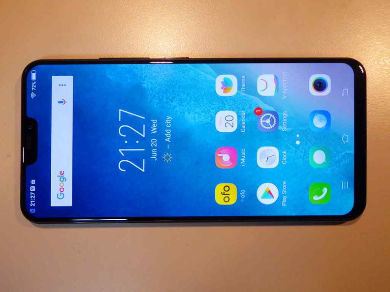
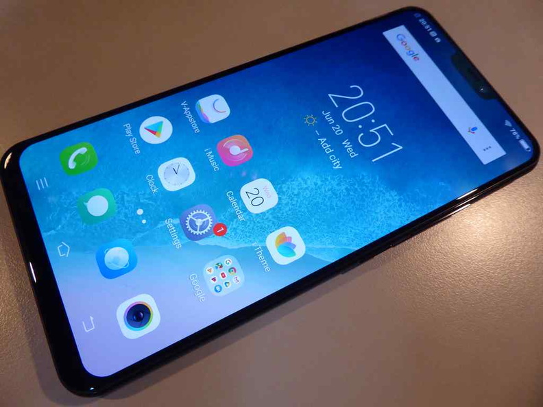
On first impressions, the phone has a wider than wide-screen screen ratio of 2:1. We first saw this in the Samsung line of galaxy phones. Hence this keeps the width of the phone small enough to hold in one hand without sacrificing overall screen dimension at 6.28 inches. This however, has issues of side letter boxing. This is evident when viewing 16:9 aspect ratio games or movies.
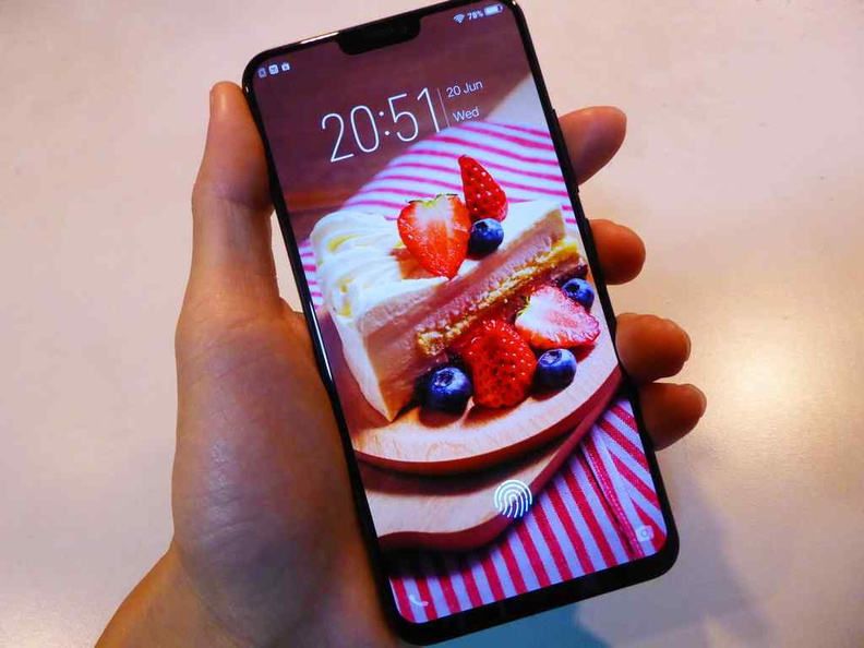
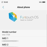
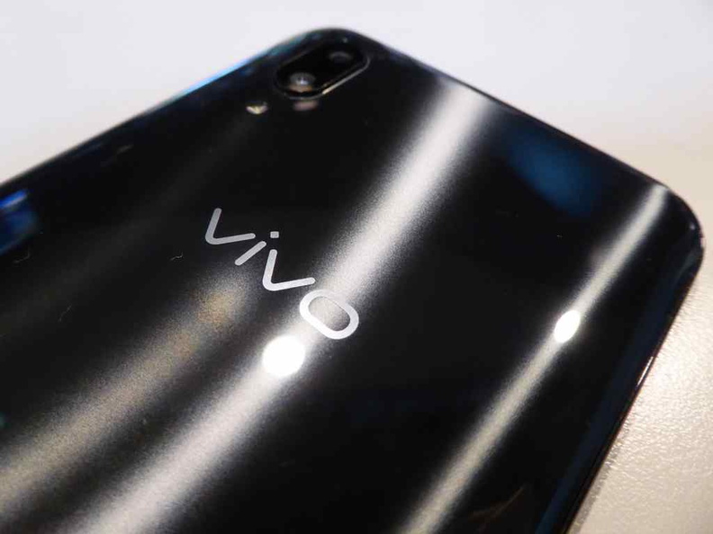
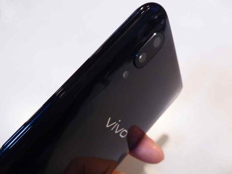
Vivo claims the X21 spots a full aluminum body with a full front glass front with a top iPhone X notch. However, the rear has more of the texture of hard glossy plastic. Also, this surface is a fingerprint magnet. Moreover, the rear of the phone constants manufacturing info, also spotting Vivo’s the four digit device codename of 1725. This is Vivo’s unique model number across their range.
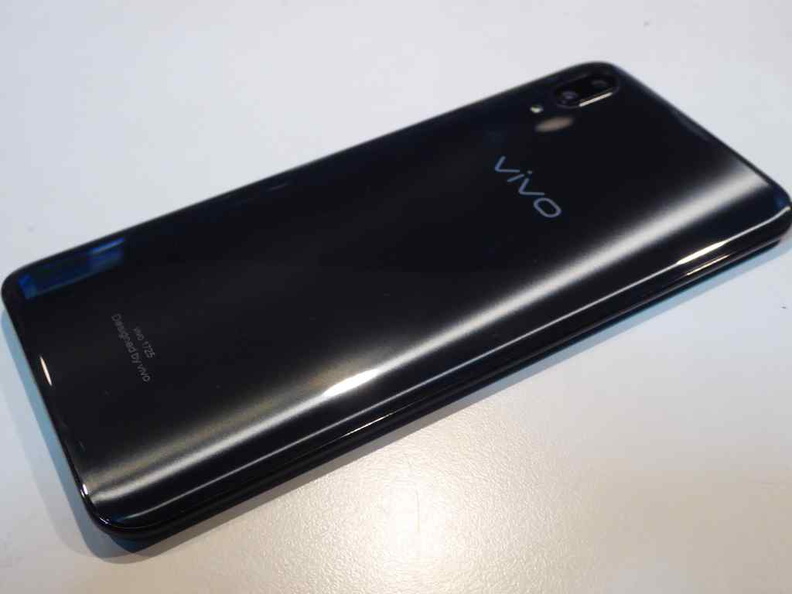
However, the phone does not feel cheap in-hand. In terms of build, the phone feels solid, compact and well made. It is noteworthy that Vivo does keep the feel of their phones largely consistent throughout their product line. Also, in-hand, the phone in comparison feels similar in built to their low-mid end V7+, which too is a rather well-built phone for its budget price segment.
Expansion and Connectivity
Connectivity in the X21 includes GSM/CDMA/HSPA and LTE. Also, you get the usual bells and whistles of Bluetooth and Wi-Fi connectivity. However, there is no NFC or wireless charging options which is often reserved for flagship models.
In addition, you have a choice of three body colours- Black, Ruby Red and Aurora White. Additionally, Vivo has colours exclusive to the Russia world cup with the X21 UD in Tibetian Blue and Victory Red.
You have a choice of two storage capacities of either 64 GB (40 GB capacity free after Android overhead) or 128 GB (100 GB free). Additionally, this can be supplemented up to 256GB of external flash storage via micro SD card expansion. Both configurations come with the same 64-bit CPU and 6 GB of addressable system RAM.
Intuitive Exterior Buttons
The X21 is simple in terms of the exterior hardware button layout. A volume rocker is located on the right edge of the phone with the main power button directly below it. Moreover, this button layout is echoed across most of the phones in Vivo’s range. This one-sided positioning is ideal for single handed use. Moreover, with all buttons on one side, it removes the guesswork of determining what buttons on which side of the phone just by touch.
On the top side of the phone, you get a 3.5mm audio jack. Strangely, Vivo had decided to locate the 3.5mm headphone jack at the top of the phone instead of the bottom. This involves swapping its location with the SIM slot which also, traditionally, sits at the top of the phone.

It is worth mentioning that the bottom placement of the headphone jack location is somewhat “industry standard”. Here, the phone will be right side up when you flip the phone up with the jack towards you in hand.
Also Vivo had thankfully decided to retain the 3.5mm jack. This saves users from a dongle-fest of adapters. The jack also serve as the phone’s FM radio antenna, a staple feature still found in Chinese phones.
Dual SIM-standby
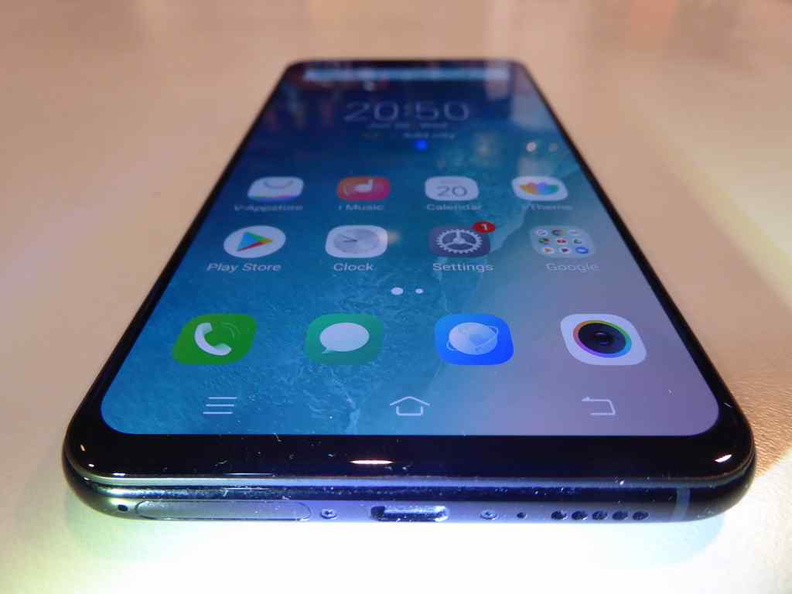
Furthermore, on the bottom side, you get the dual SIM slot. Micro-USB charging interface, microphone followed by a single loudspeaker. The dedicated microphone offers active noise cancellation. Voice calls works well and were clear in my tests.
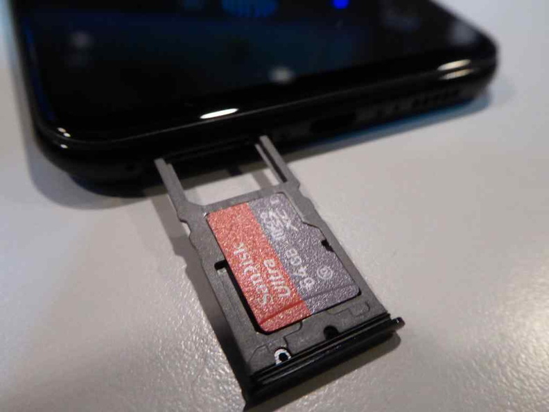
The SIM tray ejects using a pin, iPhone-style. What comes out is a rather long tray with space for two Nano-SIM slots. One slot is dedicated as the first SIM slot. Additionally, the second slot serves as a dual purpose SIM offering dual SIM stand-by as well as the microSD slot for storage expansion.
The swapping of the SIM slot and headphone jack from could be due to the X21 having a centrally seated battery between two voids. Moreover, this allows the bulk of the phone’s weight, large attributed by the battery to be at the phone’s center, giving it a more balanced feel as mentioned previously. Hence, the upper void at the head piece is home to the main motherboard. The bottom void houses a daughter board for the SIM tray, microphone, charging port and fingerprint sensor. These are linked back to the motherboard using ribbon cables.
Moreover, the inclusion of micro-USB in place of the newer USB-C port can be a mixed bag for users. This largely depends on what your main eco-system of charging cables are. For me, my power banks, earphones and smart watches all predominantly charge through micro-USB, so the omission of USB-C was a welcome.
Gorgeous AMOLED Screen
Vivo upped the game in their mid-segment by bestowing the X21 with a higher than HD screen worth bragging about. A 6.2 inch super AMOLED capacitive touch screen spotting 16 million colors sits under a layer of glass. It offers a resolution of 1080 x 2280 pixels giving it a (~402 ppi density). With it, comes the AMOLED selling points such as good saturation and deep blacks.
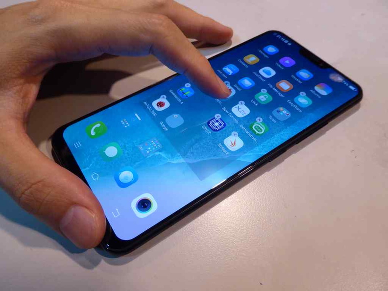
Yes, there is that notch
With the inclusion of the notorious notch, this gives the phone a 90.3% screen-to-body ratio. This notch at the top of the phone houses a traditional earpiece, light sensor and the front facing 12 MP, f/2.0, secondary camera.
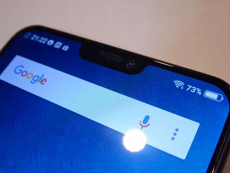
Furthermore, the notch is reminiscent of the Essential phone and of course the incumbent iPhone X where it was first introduced. However, the blatant adoption of this design ideology is fast propagated into an entire generation of Chinese phones. Today we see this coming from Xiaomi, Huawei, OnePlus and even Asus. These companies are really running out of design ideas.
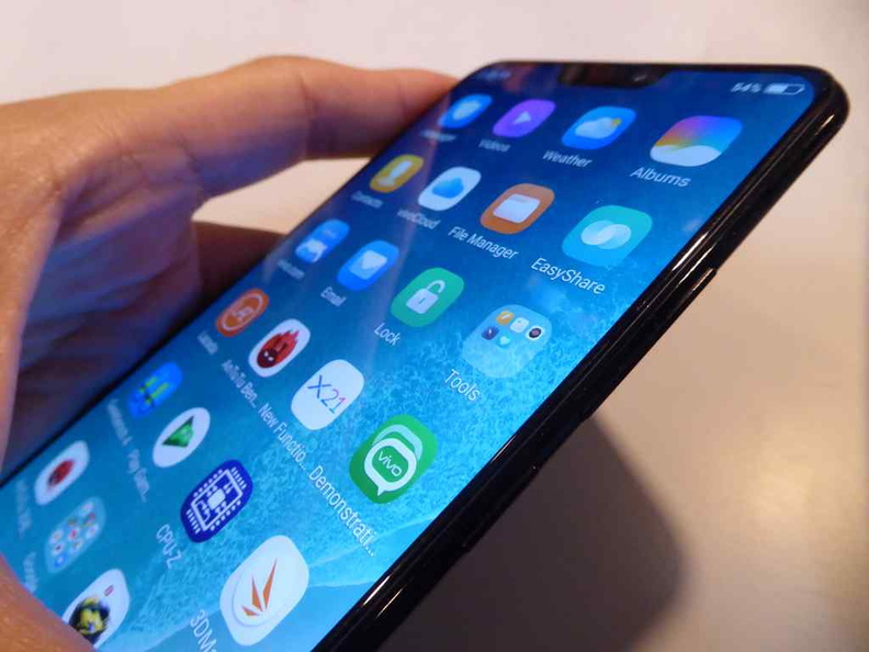
This screen to body ratio puts the X21 ahead against similar premium offerings such as the Samsung Galaxy S9 and Essential PH-1 with a screen to body ratio of 83.6% and 84.9% respectively. Still, putting it behind the Oppo Find X at 93.8% and Vivo’s own Nex at 91.24%.
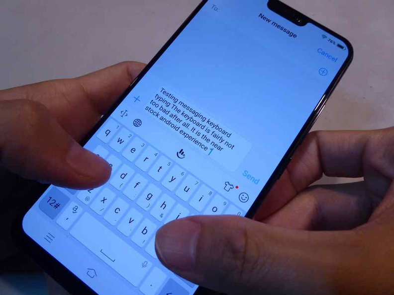
Software and Speedy UI
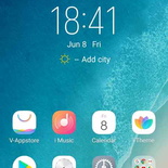
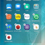
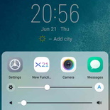
All Vivo phones runs their Funtouch OS. It is essentially a lightly reskinned version of the Android 8.1 (Oreo) Operating system which it sits on. Also, it has its own unique launcher and settings screen. The Funtouch OS I was testing is version 4.0. It is not different from the V7+ I had tested a couple of months back. Coupled with the phone’s thin width, typing on the phone even with the included stock keyboard was a breeze. There was no noticeable interface lag.
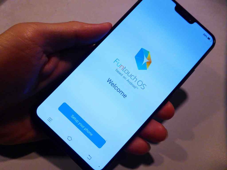
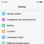
The OS shares a resemblance to iOS. I believe Vivo has kept to his familiarity which can make it easier to attract iOS users. It has a grid-like home screen which you can rearrange or delete after holding down the home button. Being largely used to the stock Android setting screen, I found the re- categorized Funtouch settings menu with their sub menus tad bit confusing to navigate at first. Some default stock Android pages such as battery management and power unity were strangely omitted from Vivo’s Funtouch menus.
Despite these gripes, I adore is how fast the OS is. The interface is rather speedy and lag-free. Swiping between icon-laddened home screens did not slow down the interface one bit. Additionally, the menus feel like it is being rendered in the range of 30-60 fps which is more than adequate.
Next part of the review I shall touch on the phone’s new in-display fingerprint sensor, camera tests, as well as cover benchmarks scores before the review conclusion. Read on!

